8 Tips to Create a Stellar Infographic
So, you want to jump on the infographic bandwagon? I don’t blame you, they are a fantastic way to visually communicate complex data. They allow your audience to digest, comprehend, and retain information at a much higher rate than mere words on paper could achieve. Nevertheless, creating a truly successful infographic requires planning and preparation. These tips should help you along the way:
1. Find your focus
Choosing a topic can be daunting. Narrowing down that topic can be even more formidable. You don’t want to communicate too broad a concept but at the same time, you don’t want to focus too specifically on a minute issue. There is a delicate balance in assembling the correct amount of information.
2. Know your audience
Understanding to whom you are speaking is crucial in crafting the language, compiling relevant data, and crafting the layout of your infographic. If you are speaking to students, you’ll want to speak to them on their level while at the same time elevate their understanding. If you are speaking to an audience who is passionate about this specific topic, you’ll want to present yourself as intelligent, knowledgeable, and in a position to teach them something that they previously didn’t know. In general, a designer knows how to craft information in a way that is most digestible to the general populace, but distinguishing a specific audience is incredibly helpful in determining the tone, look, and content of an infographic.
3. Define your structure
Once your topic is chosen and you know the audience that you are addressing, you must decide how you want to visually display the information. Do you want it to be presented as a linear timeline? Is there a cyclical component that encourages a circular configuration? Is there a process or evolution being described that would be best broken down step-by-step? Is there a complex data set that would benefit from a comprehensive set of charts and graphs? Identifying the kind of information that you have collected is the first step in deciding how it will be presented. Another aspect to consider is the mode in which this infographic will be used. Will it be printed out or viewed online? Will it be presented in media outlets, town halls, or classrooms? These instances will determine the dimensions, orientation, and overall arrangement of your infographic.
4. Establish your flow
Once your structure is defined and you have chosen the layout of this piece, you must make sure that the information and visual elements flow consistently. An infographic is like a story – connecting plot points seamlessly is essential in terms of both content as well as graphics. A viewer must be able to focus on specific areas to concentrate on more particular details but must also be able to take a step back and ascertain the larger picture – not unlike how someone might view a painting in a museum.
5. Discover your voice
This concept ties directly into knowing your audience. It is essential to establish the proper tone in order to connect with your audience but also to communicate who you are as a brand. Infographic language is typically simple, concise, and eye-catching. The goal is to draw the viewer in with friendly language and inspire them to delve deeper.
6. Determine your look
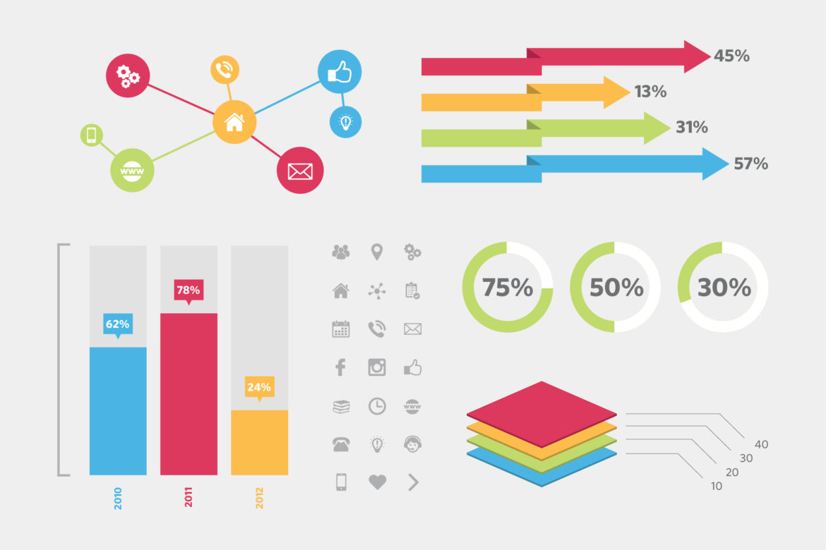
The look and feel of the piece not only supports the data that you are presenting but also complements the tone that you are establishing. It communicates to the audience swifter than any headline could. Typography, color schemes, textures, and the stylization of visual elements are crucial components. Typically, infographics employ a sophisticated set of icons to represent intricate concepts. However, the rendering of those icons is up to you. Do you want them to have a youthful, hip, or funky feel to appeal to a younger demographic? Would you rather they connote a sense of professionalism with a more modern and sleek approach? Is your goal to garner attention and go viral to spread awareness with something that’s striking? These intentions and objectives must be clearly defined in order to determine an infographic’s aesthetic.
7. Revise your design
At R&J, we have dubbed this concept: Rinse & Repeat. No great infographic was ever created in the initial draft. Crafting a successful infographic can take months and many rounds of revision. As I mentioned earlier, there is a delicate balance that must be struck and perfecting that balance takes time. There is no one way to display information, and because of this, the same story can be told in many ways. Determining the most effective structure for an infographic is key.
8. Verify your facts
Above all else, it must communicate essential information that needs to be both compelling and truthful. Statistical data must be correctly cited and facts and figures must be accurately represented.
An infographic must be simple, it must be creative, and it must be original. It is just like any other story. It needs to have a clear and consistent flow, communicate to its audience effectively, and represent its data and sources accurately. Most importantly, an infographic should instruct and educate. Essentially, if you have information and an audience to whom you would like to communicate this information, an infographic might be something to consider. But just in case this article hasn’t convinced you, take a look at the impact that an infographic can make. Research infographics on Google, Pinterest, etc.
Feel free to check out a few of the infographics that R&J has recently developed for RWJ Barnabas Health, NJVMA, Thomson Reuters, and Hackensack UMC. Or contact me – jrothschild@dev.randjsc.com or on Twitter at @rjscjenn. I’d be happy to help steer you in the right direction.


